
Back to blog

Image Ad Examples: 20 Real Static Ads and the Job Each Frame Does

Twenty static image ads, harvested from the public Meta Ad Library and shown as they ran. Under each one is the hook as it is set inside the frame, the pattern it belongs to, and what the frame is actually doing. Below the gallery are the six jobs a static ad has to do in one rectangle, and the four mistakes that waste the format.

Marián Cabadaj Marián Cabadaj 11 min read

Our articles are still written by HUMANS! Get human written articles in your Google feed.

Add as preferred source

Twenty real image ads

Harvested from the Meta Ad Library. The quoted line on each card is the hook as it is set inside the creative. The line labelled Headline underneath is the ad own headline field, which is often a different sentence entirely.

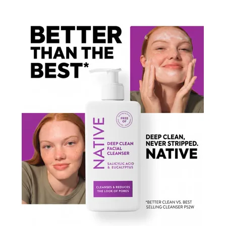
A Native image ad: the words better than the best beside a facial cleanser bottle and two faces mid-wash
Native

Comparative claim with the footnote on it

Better than the best

Headline: Deep clean, never stripped

Four words that only mean something because of the asterisk under them, which names the comparison: the best selling cleanser. A superlative with its own measurement attached is harder to dismiss than the same superlative alone.

See it in the Meta Ad Library
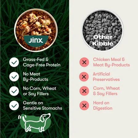
A Jinx image ad: a bowl of Jinx food with four green ticks beside a bowl of grey kibble with four red crosses
Jinx

Us against them, in one frame

Jinx. Other kibble.

Headline: High quality protein, no fillers, no mystery meat

Two bowls, two columns, ticks on the left and crosses on the right. The buyer does no work: the comparison they would have made in a browser tab is made for them, and the category becomes the competitor rather than any one brand.

See it in the Meta Ad Library
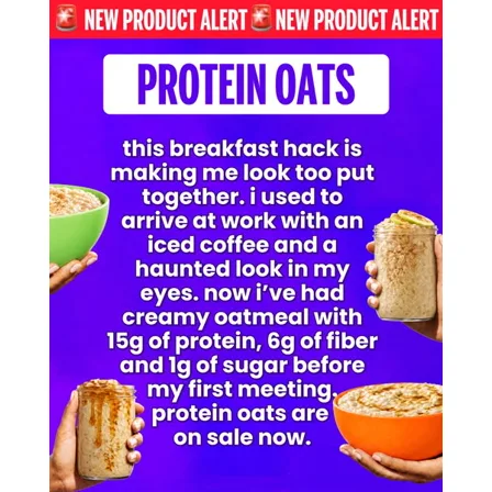
A Magic Spoon image ad: a block of white first-person text on purple, surrounded by hands holding jars of oats
Magic Spoon

The ad that looks like a post

This breakfast hack is making me look too put together

Headline: Protein oats, 15g protein, 6g fiber, 1g sugar

A wall of first-person text on a flat purple background, formatted the way somebody types rather than the way a brand designs. It reads as a recommendation from a person until the numbers arrive, and the numbers are the only brand-shaped thing in it.

See it in the Meta Ad Library
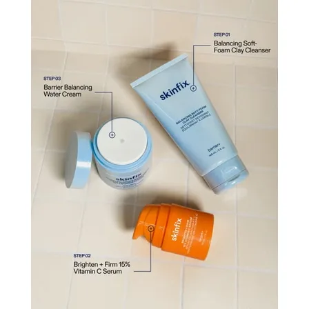
A Skinfix image ad: a cleanser, a vitamin C serum and a water cream on bathroom tile, each labelled step 01, 02 and 03
Skinfix

The routine, numbered

Step 01, step 02, step 03

Headline: Clinically formulated for clear, bright and balanced skin

Three products laid on a tiled floor with numbered callouts. It sells an order of operations rather than a product, which raises the basket and answers the real question a beginner has, which is what goes on first.

See it in the Meta Ad Library
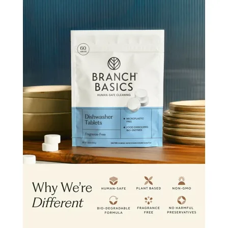
A Branch Basics image ad: a pack of dishwasher tablets on a kitchen counter above six labelled icons
Branch Basics

Icon grid of reasons

Why we are different

Headline: Dishwasher tablets, free from plastic casing, fragrance and dyes

Six icons under the pack, each one a single objection: human safe, plant based, non-GMO, biodegradable, fragrance free, no harmful preservatives. Nothing here is argued, it is listed, which works when the buyer already knows what they are avoiding.

See it in the Meta Ad Library
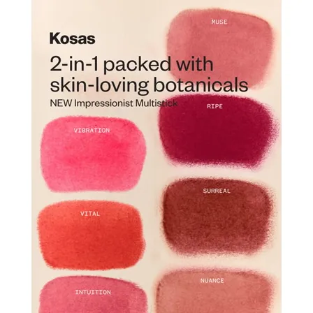
A Kosas image ad: seven multistick colour swatches on cream, each labelled with its shade name
Kosas

Swatches instead of a model

2-in-1 packed with skin-loving botanicals

Headline: New Impressionist Multistick

Seven smears of colour with their shade names, and no face anywhere. The ad answers the only question a colour buyer has, which shade, and it does it without asking them to imagine the product on somebody else.

See it in the Meta Ad Library
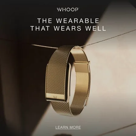
A WHOOP image ad: a gold mesh band photographed on a wire against a warm dark background
WHOOP

Product as an object

The wearable that wears well

Headline: Designed to be worn 24/7

A gold mesh band lit like jewellery, one line, and a learn more. No metrics, no app screen, no athlete. It argues the thing a health tracker usually cannot: that you would put it on when you are not training.

See it in the Meta Ad Library
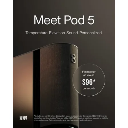
An Eight Sleep image ad: the Pod 5 unit in low light with a circle reading finance for as low as 96 dollars per month
Eight Sleep

The price, restated as a month

Finance for as low as $96 per month

Headline: Meet Pod 5. Temperature. Elevation. Sound. Personalized.

A three thousand dollar product turned into a number the buyer can compare to a subscription, with the terms in small print at the bottom of the frame rather than a click away. The disclosure is part of the ad because the claim needs it.

See it in the Meta Ad Library
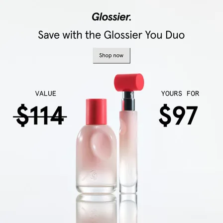
A Glossier image ad: two fragrance bottles between a struck-through value of 114 dollars and a price of 97 dollars
Glossier

Anchored price

Value $114, yours for $97

Headline: Save with the Glossier You Duo

Two numbers, one struck through, set either side of the products at the same size. The saving is not stated as a percentage anywhere, because a number the buyer subtracts themselves lands harder than one they are handed.

See it in the Meta Ad Library
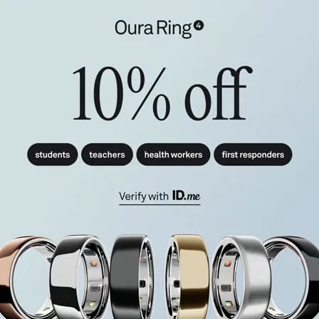
An Oura image ad: ten percent off above four eligibility chips and a row of rings in six finishes
Oura

Discount with a door policy

10% off for students, teachers, health workers, first responders

Headline: Verify with ID.me

The offer is the headline and the eligibility is the argument. Naming four groups does what a blanket discount cannot: it flatters the people who qualify and protects the price from everyone else, and the verification step makes it feel earned.

See it in the Meta Ad Library
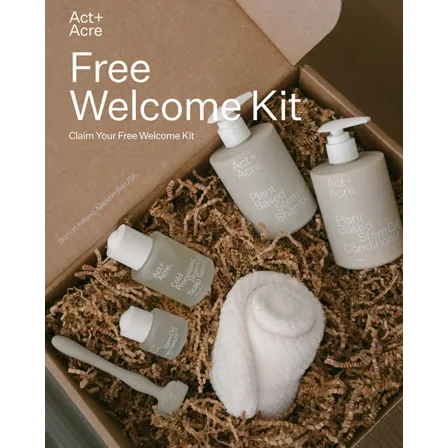
An Act and Acre image ad: an open cardboard box of shampoo, conditioner, serums, a scalp brush and a towel on shredded paper
Act+Acre

Free kit as the whole offer

Free welcome kit

Headline: Claim your free welcome kit

An opened box shot from above, so the reader counts what is in it before they read anything. The word free is doing the work, and the packaging is doing the believing: nothing about the formula is claimed anywhere on the frame.

See it in the Meta Ad Library
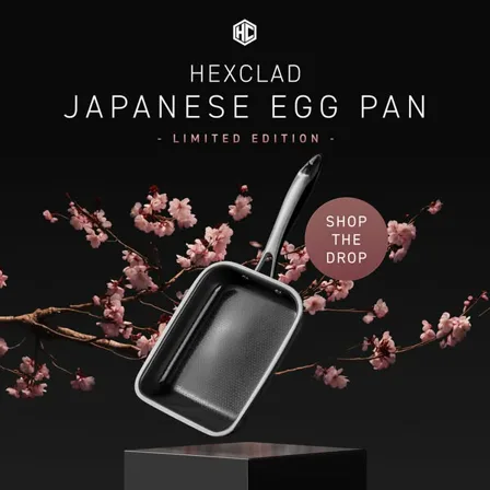
A HexClad image ad: a rectangular Japanese egg pan on a black plinth with cherry blossom behind it
HexClad

The drop

Japanese egg pan, limited edition. Shop the drop.

Headline: For the rolled omelettes of your dreams

A single pan on a plinth under cherry blossom, lit like a phone launch. Limited edition supplies the deadline that a permanent product has to manufacture, and a specific shape gives an owner of the range a reason to buy again.

See it in the Meta Ad Library
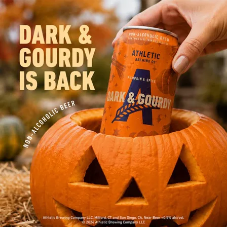
An Athletic Brewing image ad: a hand lifting a Dark and Gourdy can out of a carved pumpkin under the line it is back
Athletic Brewing

Seasonal return

Dark & Gourdy is back

Headline: Non-alcoholic pumpkin and spice brew

Back is the entire hook, and it only works on somebody who remembers last year. The can is being lifted out of a carved pumpkin, which dates the ad on purpose: a seasonal frame earns attention for six weeks and is worthless in January.

See it in the Meta Ad Library
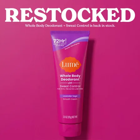
A Lume image ad: the word restocked in white on hot pink above a whole body deodorant tube
Lume

Restock as news

Restocked

Headline: Whole Body Deodorant plus Sweat Control is back in stock

One word, set enormous, that says nothing about the product and everything about demand. It works on the people who tried to buy and could not, and it signals popularity to everyone else without making a claim anybody could dispute.

See it in the Meta Ad Library
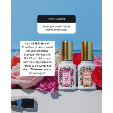
A Poo-Pourri image ad: an ask me anything question card above a typed answer, beside two bottles among flowers
Poo-Pourri

Screenshot of somebody else saying it

I am obsessed with the new scent of the year collection

Headline: Natural odor fresheners

The frame is built as a question and an answer, typed rather than designed. Putting the claim in a customer voice moves it out of advertising and into recommendation, and the brand never has to make the claim itself.

See it in the Meta Ad Library
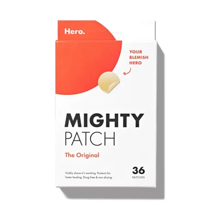
A Hero Cosmetics image ad: the Mighty Patch Original box on white with an arrow pointing at a single patch
Hero Cosmetics

Pack shot that reads as an ad

Your blemish hero. 36 patches.

Headline: Mighty Patch Original

No model, no background, no line of copy that is not printed on the box. It works because the packaging was designed to be legible at thumbnail size, which is rarer than it sounds and cheaper than any shoot.

See it in the Meta Ad Library
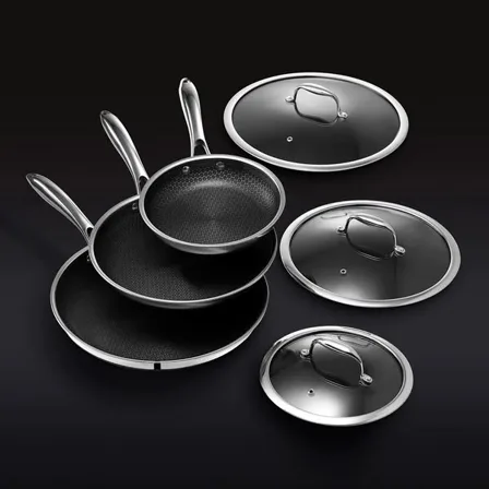
A HexClad image ad: a full set of hybrid pans, pots, lids, bowls and knives arranged on a black background
HexClad

The whole range, as one object

No line at all

Headline: Shop up to 30% off our bestselling sets

Fourteen pieces arranged on black, and nothing else. Showing the full set answers the only question a buyer at this price has, which is what they get for the money, and it makes the discount in the headline field feel like it applies to a lot.

See it in the Meta Ad Library
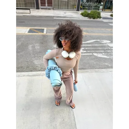
A Bala image ad: a creator on a pavement carrying a yoga mat, wearing the brand weights over a beige outfit
Bala

Shot like a post, not an ad

No line at all

Headline: Workout gear that actually looks good

A phone photo on a pavement, product in hand, no type anywhere. It buys attention by not looking bought, and it fails the moment a viewer decides it is an ad, which is why the caption does the selling and the frame does not.

See it in the Meta Ad Library
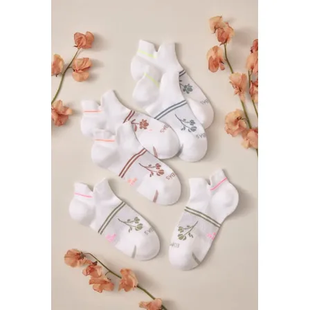
A Bombas image ad: six pairs of white ankle socks laid out with dried orange flowers on a cream background
Bombas

Styled flat lay

No line at all

Headline: Bombas Run, cushioned in the heel and toe

Six pairs of socks and some dried flowers, arranged like a magazine page. There is no argument in the frame, so everything depends on the headline underneath it, and in a feed that is a coin toss.

See it in the Meta Ad Library
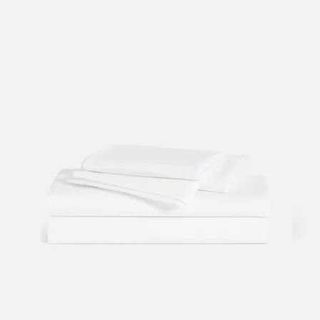
A Brooklinen image ad: a neatly folded stack of white sheets and pillowcases on a pale grey background
Brooklinen

Catalogue shot, the counter-example

No line at all

Headline: Mix, match and save on the bedding bundle

Included as the counter-example. A folded stack of white sheets on white, which is a product photograph rather than an ad: it makes no claim, names no problem, and would work identically for any bedding brand on the market.

See it in the Meta Ad Library

Key takeaways

  • Six of the twenty lead on a number, and in each case the number is the largest thing in the frame.
  • The frames that work are legible at thumbnail size. Two or three lines is the working range.
  • Three of them borrow a voice: a customer review, an editorial format, and a licensed collaboration.
  • Five of the twenty are discount-led and only two attach the discount to an occasion. A discount with no expiry teaches buyers to wait.
  • The product hero shape is here as the counterexample. It asks the reader to already care about the brand.

The six jobs a static ad has to do in one rectangle

A single frame cannot sequence an argument the way a carousel or a video can. These are the six moves the twenty ads above use instead.

Job

Say who it is for in the first two words

Oura names four groups on the frame, students, teachers, health workers and first responders, and disqualifies everybody else on purpose. A static ad has one rectangle to qualify a reader, and naming the audience does it faster than naming the product.

Job

Survive at thumbnail size

Every frame that works here is legible at 200 pixels. Lume sets one word at cover scale, Native sets four. The dense frames, Magic Spoon's wall of typed text and Skinfix's three numbered steps, need a tap first, which is a cost rather than a mistake as long as it is deliberate.

Job

Answer the objection before the benefit

Branch Basics spends six icons on what the product is free from. Jinx gives half its frame to a column of crosses against the category. The reader has already had the doubt, and an ad that gets there first is believed more easily.

Job

Let the number be the creative

Six of these twenty lead on a figure: $97 against $114, $96 a month, 10% off, 30% off, 36 patches, three numbered steps. In each case the figure is the largest element and the product photograph is decoration.

Job

Borrow a voice that is not yours

Poo-Pourri sets a customer answer at headline size. Native footnotes its superlative with the data it came from. Oura sends the discount through an identity check. All three are borrowing credibility the brand cannot assert on its own.

Job

Give the sale a reason

Athletic Brewing attaches its can to autumn. HexClad attaches its pan to a limited drop. A reason with a calendar in it expires. An offer without one teaches buyers to wait.

The hook inside the frame is not the headline field

Each card above shows two lines of copy, and they rarely match. The quoted line is the text set into the image, which is what a scrolling buyer actually reads. The line labelled Headline is the separate text field the advertiser filled in, which appears under the creative in the feed and is frequently a plain product name.

Lume is the clearest case in this set. The creative says one word, "Restocked", while the headline field says "Whole Body Deodorant plus Sweat Control is back in stock". Quoting the headline alone, which is what most roundups do because it is the field an export gives you, would describe an ad nobody ran. If you are studying competitors, read the pixels, not the spreadsheet, and read them across a whole advertiser set the way the LinkedIn ad examples do. The same discipline applies to a carousel, where the argument is spread across frames rather than compressed into one.

Four ways static ads get wasted

  • Leading with the product shot

    Brooklinen is in this gallery as the counterexample: a folded stack of white sheets on white, carrying no line at all. A product photograph asks the reader to already care, and most of a cold feed does not. It is the shape new advertisers reach for first and the one that needs the most brand equity to work.

  • Writing copy that needs to be read at full size

    The Branch Basics frame carries six icon claims under the pack, and Magic Spoon fills its whole rectangle with typed text. Both earn their density in categories where people read labels. The same treatment on an impulse product is a frame nobody decodes before scrolling past.

  • Running a discount with no expiry attached

    Five of these twenty are discount-led and only two name an occasion. A permanent offer stops being an offer, and a brand that always has 30% off has simply repriced itself while paying for the ad twice.

  • Copying the layout instead of the pattern

    These twenty frames use maybe six arguments between them. The type treatment is the least transferable thing in any of them. Take the pattern, run it against what your own product can prove, and let the design follow.

Image ad examples: common questions

01 What is an image ad? +

An image ad is a single static creative, one frame with no video and no swipe, carrying its whole argument in one rectangle. It is the cheapest ad format to produce and the most common one running on Facebook and Instagram.

02 Where do these image ad examples come from? +

All twenty were harvested from the public Meta Ad Library, which is free and needs no advertising account. Each card links the permalink for the ad it came from, so any example here can be checked at the source.

03 What size should an image ad be? +

Every creative in this gallery is square. Square is the safe default across Facebook and Instagram feeds because it fills the column on mobile without being cropped, and the same file can run in several placements.

04 How much copy should go inside an image ad? +

Most of the frames that work here carry between two and eight words. Denser frames exist in this gallery and they belong to categories where buyers read labels. If the line is not legible at thumbnail size, it is not doing any work.

05 Do image ads still work compared with video? +

Every brand in this gallery was running static image ads on the day the set was harvested, alongside their video. Static is cheap enough to run many versions of, which is what makes it useful for finding the argument before spending on production.

Selzee is your AI content team. It researches what your market is arguing, turns it into concepts, and writes the frames, so a pattern you just read becomes your next campaign instead of a screenshot in a folder.

Make your next image ad with Selzee

Keep exploring: LinkedIn ad examples, Carousel ad examples, UGC ad examples, Find competitor ads.

Share this article

ask ai about selzee

© 2026 Selzee. All rights reserved.